R Tutorial
Using R for Basic Calculations | Tutorial Main Menu | Statistical Analysis
Section 3: Developing Scatterplots
Creating a Scatterplot in R provides one with a number of customization options and features. For example, you can color each point separately, make 3D models, and even design your own packages using graphics.There are two general ways to create a Scatterplot in R. We will cover both methods listed below. You can either:
Code the graph manually within the R console
Download the Recommender package, import the data, then generate a Scatterplot
Create a Scatterplot using code
To get started with a scatter plot, we must first import the dataset that the plot will be based on. To do this, we will use the read.file_extension function. The syntax for using this function is as follows: read.file extension("file name.file extention")
For example, if your file is named Beer.csv, the command you would use is: read.csv("Beer.csv")
The available file types that R will allow you to import and their associated functions are listed below:
SPSS -- read.sav("your_file.sav")
Excel -- read.xls("your_file.xls")
CSV -- read.csv("your_file.csv")
Table -- read.table("your_file.txt")

Figure 3-1
The command <Variable Name> = read.file_type("your_file_name.extension") will allow you to store your dataset into a data frame to work with a perform other fucntions on. A data frame is basically a variable that stores a data table.
For example, with the Beer.csv file, if we want to easily run other functions on that set of data, we can issue the following command: Beer = read.csv("Beer.csv")
Now we can easily work with the name Beer in this R session. Note that Beer was an arbitrary data frame name choice -- we could have easily picked another name (such as BeerData)
You will notice upon entering the code there isn't any data output in the console. This is completely normal. Under the Data box on the top right of the interface, there is now a field for Beer showing the number of observations and the number of variables.
NOTE: The symbols = and <- function the same in R.

Figure 3-2
We will now code the Beer data set. First it has to be read and attached, then the plotting can begin.The two variables we will utilize from the data set are Price and Calories. The codes are shown below with comments to explain the function of each.
Beer =read.csv("Beer.csv") Creates the data frame variable Beer
attach(Beer) Attaches the Beer data to allow plotting.
plot(price, calories) Plots the data for the defined variables.
lines(lowess(price,calories), col="blue") Adds a line of best fit(optional)
NOTE: By default, R will place a bracket(>) before each line of code. The code listed above DOES NOT include that bracket and thus assumes it is typed AFTER the default bracket.
The generated Scatterplot from these commands is shown in Figure 2-3.

Figure 3-3
Create a Scatterplot using Rcommander
To generate a scatterplot in Rcommander, you need to import your data set. In the below example, we will import an SPSS data set(.sav file)

Figure 3-4
From the Import SPSS Data Set window, type in the name of the data set. Although you are able to choose any name you want, it is important to keep your titles consistent, especially if you are dealing with multiple data sets and tables. We will use Beer as the name for this data set.
Upon clicking OK, you will be taken to the explorer window to choose the file associated with your data set.

Figure 3-5
Now that the data has been sucessfully imported into Rcommander, it is time to create the Scatterplot!
First click on the Graph drop-down menu, then Scatterplot.

Figure 3-6
On the Scatterplot window, you are able to choose one variable for the X and Y axis respectively. Once you have one variable highlighted in each box, click the OK button to generate the Scatterplot.

Figure 3-7
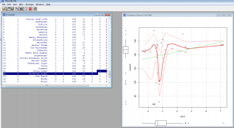
After you generate the Scatterplot in Rcommander, you will notice the graph opens up in the origional R console where it has the data listed out on the left with the graphical depiction of the two selected variables on the right.

Figure 3-8