SPSS Tutorial
Analyzing a Dataset | Tutorial Main Menu | Training Homepage | Copying to Word
Section Six: Creating Scatter Plots
In this section, we will cover how to create scatter plots, demonstrating also how to use the Best Fit Line option. As our example, we will use the "Beer.sav" file located in Y:\PS371-W.
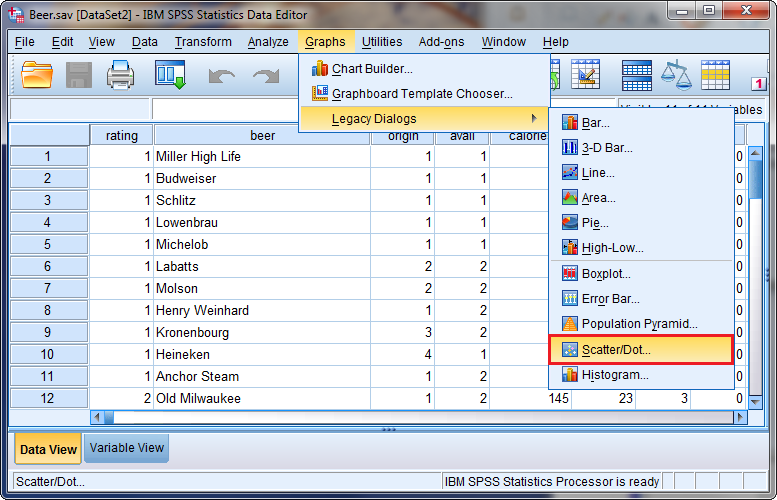
Figure 6-1
Once the dataset has been opened, open the Graphs menu, and select Scatter/Dot under the Legacy Dialogs sub-menu.
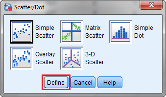
Figure 6-2
The Scatter/Dot window will appear. Click on the Simple Scatter plot icon, and click Define.
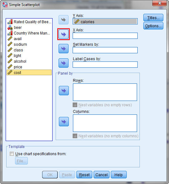
Figure 6-3
Here, you can indicate the parameters of your scatterplot. For this example, we will be plotting the variables of "calories" and "cost." Use the arrows to move "Calories" to the Y Axis, and "Cost" to the X Axis. When finished, click OK.
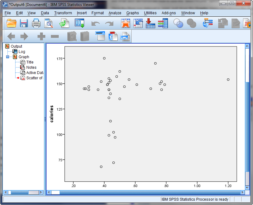
Figure 6-4
The output window will now appear, showing the scatterplot.
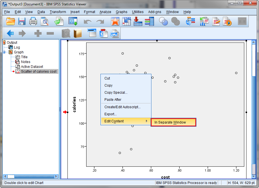
Figure 6-5
If you would like to display the fit line of a scatterplot you have created, right-click on it and select In Separate Window from the Edit Content sub-menu.
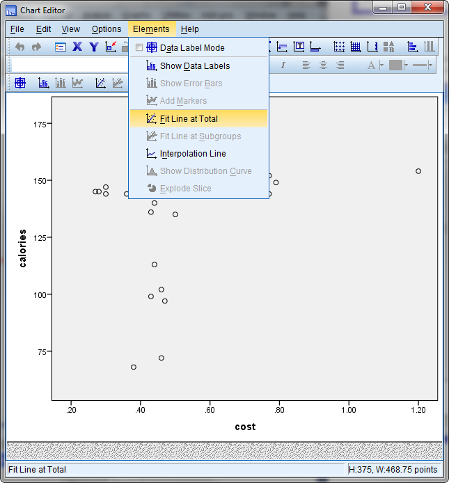
Figure 6-6
The Chart Editor window will now open. Select Fit Line at Total from the Elements menu.
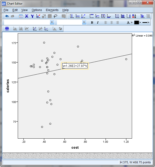
Figure 6-7
Once the fit-line type is chosen, the scatterplot will display the fit line, as shown above in Fig. 6-7.