BlueGriffon Tutorial
<< Customizing the BlueGriffon Toolbars
Complying with the Americans with Disabilities Act
The "ADA," or Americans with Disabilities Act, became part of U.S. law in 1990. A particular section of the act (Sec. 508) deals with information, and requires that it be accessible to people with motor, visual, or hearing disabilities. In this section of the BlueGriffon tutorial, we will detail what is required to be in conformity to the ADA in regards to your web pages, and how to best do this in the BlueGriffon program.
Alternate Text for Graphics
Alternate text, otherwise known as "alt text," provides a textual description of the information contained in the image. Whenever inserting an image into your page, you ought also to provide "alt" text in order to make it easier for those who cannot see the image to still be able to discern its content. In addition to the surrounding text on the page, the alt text will be read by special assistive software, such as a screen reader or braille display.
According to the guidelines established by the ADA, the information in the alt text should convey as much meaning as the image itself. In simple images, such as a picture of Rembrandt, for example, the alt text could read something like "A picture of Rembrandt admiring a statue of Aristotle." For more complex graphics, such as charts, graphs, or maps, you may have to include a bit more detail. Care should be taken, however, to ensure that the description of the graphic is as succinct as possible while at the same time conveying the same information provided by the graphic itself.
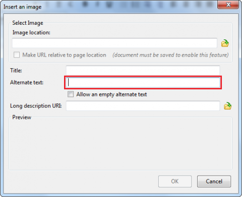
Fig. 17-1
Inserting alt text is fairly straightforward. Simply enter it when you're inserting the image (Fig. 17-1), in the box to the right of Alternate text.
Multimedia and Applets
In addition to images, multimedia content ought also be made accessible. Unfortunately, there currently exist no native tools with which you can make audio and video content more accessible, but following at least one of the following guidelines can achieve the purpose of compliance with the ADA.
Audio and Video
For audio content:
- Provide a transcript of the audio, which provides what is spoken in the audio in readable text format
- Provide a description of the audio, which might be used either in addition to a transcript to provide commentary, or by itself as summary of the audio file's contents
- Include a link to a separate page which contains a summary or transcript of the file
- Include closed captioning with the audio
For video content:
- Provide a summary (either aurally in a separate audio file, or textually within the page or in a separate document)
- Include a synchronized audio track in the video file itself
- Include captioning, either open or closed (for more information on captioning, see this page)
To add captioning to a video or audio file, you can use Movie Captioner, which can be downloaded here. The guidelines above also can apply to applets programmed in Java or Flash.
Content Links
The ADA also stipulates that if there is a media introduction to your site, or if a particular page has a series of links before the actual content begins, you ought to include a link that allows those using assistive technologies to skip to the main content.
Table Headers
When creating a table in order to organize your data or display information, you ought to include headers for the table to delineate where one field ends and another begins. For more information on creating tables in BlueGriffon, see the section on Tables.
Color and Contrast
It is very important to make sure that your background and foreground (text) colors allow for easy reading. If the color values are too close together, for instance using a white background and light green or blue text, it will be very difficult to read your page. A good option for color formatting is black text against a white background, or vice-versa.
Keeping this simple color scheme can increase site readability, particularly for those who view webpages using a high-contrast color profile. Viewing a page in high-contrast inverts the values of each color (similar to a negative in photography), making it more visible to those with low or impaired vision. If you are using a color scheme that varies widely from white/black or black/white (excepting links and images, of course), it could make your site unreadable to those who regularly view web content in this high-contrast mode.
In addition, you should also ensure that your site allows the browser to change the font and colors of your text, as well as the background if otherwise specified by the user.1 These are normally changeable by the web browser, and pages created in BlueGriffon allow this by default, although sites utilizing a more complicated design format could make this difficult.
To change both your foreground and background colors, use the BlueGriffon toolbar (see Fig. 17-2 below).

Fig. 17-2
Clicking on either of these options will bring up a color palette, where you can choose which color you would like to use. Again, it is important that the text and background colors do not blend together, as people with visual impairments may find your page difficult to read.
Using a certain color for emphasis can also present a problem, since screen readers cannot emphasize color. For instance, say you have a list of people who ran in a local election, and emphasize the incumbent in red.
Del Boca Vista Election Results
- Cosmo
- Morty
- Jack
To make the emphasis readable by a screen reader, you could also add appropriate text before and/or after the names of those in the race.
Del Boca Vista Election Results
- First: Cosmo
- Second: Morty (Incumbent)
- Third: Jack
Having added textual emphasis in addition to the change in color, the screen reader will now textually convey the emphasis which had formally been conveyed only visually.
Blinking, Moving, or Flickering Content
If any flashing text, images, or multimedia are incorporated into your website it is required that you ensure the content does not flash at a rate between 2 to 55 times per second, as this range has been prone to cause seizures in persons with photosensitive epilepsy. As a rule, however, any flashing, flickering, or moving content ought to be avoided entirely, since doing so serves as a major distraction to visitors and results in the site looking unprofessional.
Time-Sensitive Responses
If you are utilizing a server that includes a time-out clock, which prevents the refreshing of a webpage after a certain amount of time has elapsed, you ought to have the time interval written somewhere on the page itself.
Text-Only Pages
If your site contains frames, animation, and other non-textual elements which may make it difficult to be read by a screen reader, the same content ought to be presented in a separate "text-only" pages linked to each of the content-rich pages. To reiterate, however, it is best to design your site in such a way that this does not become an issue.
If you would like more information on how to make your website ADA compliant, see the More Information section below. If you have specific questions, or would like to have your site inspected for compliance, you may contact Greg Kraus at the OIT Accessibility Office.
1. ADA Tool Kit: Website Accessibility, Sec. 1, Par. c.